使用R语言统计多蛋白多组的WB数据
临床上经常使用WB验证蛋白表达水平,使用ImageJ算出个泳道的灰度值以后,需要做归一化和均一化处理,步骤如下:
- 首先计算目的蛋白/内参蛋白得到相对比,(有的人直接拿这个来统计,当然也可以,但是对照组就不是1)
- 拿各个相对比再除以各组的对照组组的相对比,这样对照组就都是1了
这个功能可以很容易使用Excel or WPS实现,当然也可以直接进行T检验,但是发现如果所有值是1的话,是无法在excel上使用t检验函数的,当然最常见的是SPSS,最常用的作图工具是Graphpad Prism或Origin,不过定制性最高的却是R
比如有这样一个WB表格数据
| sample | A | B | C | Actin |
|---|---|---|---|---|
| NC1 | 128061 | 362791 | 73876 | 595320 |
| OE1 | 444296 | 685776 | 205065 | 595894 |
| DR1 | 760531 | 1008761 | 336254 | 596468 |
| NC2 | 206016 | 267960 | 126144 | 553840 |
| OE2 | 454608 | 624546 | 251256 | 545392 |
| DR2 | 703200 | 981132 | 376368 | 536944 |
| NC3 | 215730 | 236808 | 118008 | 560008 |
| OE3 | 441000 | 639600 | 255750 | 560505 |
| DR3 | 666270 | 1042392 | 393492 | 561002 |
从excel里面复制以后,可以从excel直接粘贴数据 (Mac系统代码)
wb <- read.table(pipe("pbpaste"), # 读取剪切板中的数据
                      sep="\t", # 指定分隔符
                      header = TRUE)
如果是windows系统,那么代码就是:
### wb <- read.table(file = "clipboard", sep = "\t", header=TRUE) # 接着我们开始进行计算
1. 首先是用目的蛋白/内参蛋白(actin),我定义为x_r
wb$A_r<-wb$A/wb$Actin
wb$B_r<-wb$B/wb$Actin
wb$C_r<-wb$C/wb$Actin
2. 用x_r除以NC组的相对比,我将他定义为’x_n’.由于没有excel的$E$2这种实现固定的办法,因此我想办法曲折了一下,我的思路是先新增一列A_n,然后前3行除以A_r的第一行,中间三行除以A_r的第四行,后三行除以A_r的第七行,然后居然成功了,后面同法计算B和C蛋白的归一化值.
wb$A_n[1:3]=wb$A_r[1:3]/wb$A_r[1]
wb$A_n[4:6]=wb$A_r[4:6]/wb$A_r[4]
wb$A_n[7:9]=wb$A_r[7:9]/wb$A_r[7]
wb$B_n[1:3]=wb$B_r[1:3]/wb$B_r[1]
wb$B_n[4:6]=wb$B_r[4:6]/wb$B_r[4]
wb$B_n[7:9]=wb$B_r[7:9]/wb$B_r[7]
wb$C_n[1:3]=wb$C_r[1:3]/wb$C_r[1]
wb$C_n[4:6]=wb$C_r[4:6]/wb$C_r[4]
wb$C_n[7:9]=wb$C_r[7:9]/wb$C_r[7]
首先需要把短数据转换为长数据,把样本留下,添加一列蛋白和一列灰度值,分别命名为’protein’和’value’.
library(reshape2)
wb_long<-melt(wb,
                id.vars = c('sample'),##需要保留的列,非数字格式
                measure.vars=c('A_n','B_n','C_n'),##需要保留的值,数字格式
                variable.name='Protein',##新定义个列并命名,非数字格式
                value.name='Value')##新定义一个列并命名,数字格式
新增一个分组,如果是单纯按NC、OE、和DR排序的话,完全可以
wb_long$Group=rep(c('NC', 'OE','DR'), each = 3) ##分为3组,每组3个数据但是这个数据是按NC1,OE1,DR1,NC2…这样排序,所以上面代码分组后是错的,最简单的办法是导出csv,然后Excel简单定义一下,其实也就是把数字去掉,加个Group的组就行,但是这部操作R我还没学会,有个shiny的包可以交互式处理数据,但是又不能直接保存到Environment里,其实这种简单的处理,完全可以先excel处理好了以后再作图,毕竟excel号称除了不能生孩子…
当然如果你想用shiny,可以按照DataEditR这个包,直接安装即可,但前提是要先安装好shiny
instal.packages(“shiny”) instal.packages(“DataEditR”) library(DataEditR) data_edit(wb_long)
这样就可以像excel那样处理表格里,导出数据,再导入数据.
wb_long<-read.csv("/Users/mac/Documents/GitHub/blog/content/post/2021-08-11-使用r语言统计多蛋白多组的wb/wb_long.csv")固定一下分组的顺序,需要先设置为因子
wb_long <- within(wb_long, Group <- factor(Group, levels = c("NC", "OE","DR"))) 画图,这里联合ggplot2和ggpubr,其实ggpubr可以一步出图,但是底层限制死了,我们可以借助ggppubr进行统计,画图还是用ggplot2,统计的是两种,首先进行anova看整体差异,然后看各组与对照组的差异
library(ggplot2)
library(ggpubr)
ggplot(wb_long ,
       aes(x=Group,y=Value,color=Group,fill=Group))+
    geom_bar(stat="summary",fun=mean,position="dodge")+
    stat_summary(fun.data = 'mean_sd', geom = "errorbar", width = 0.5,position = position_dodge(0.9))+
    facet_grid(~Protein,scales = 'free')+
    theme_minimal(base_size = 12)+
    labs(x=NULL,y='Relative protein expression')+
    geom_dotplot(stackdir = "center", binaxis = "y",
                 fill = "lightgray",
                 dotsize = 0.9,position = position_dodge(0.9))+
    stat_compare_means(method = "anova")+
    stat_compare_means(method = 't.test',label = "p.signif",comparisons = list(c('NC','OE'),c('NC','DR')))
## Bin width defaults to 1/30 of the range of the data. Pick better value with `binwidth`.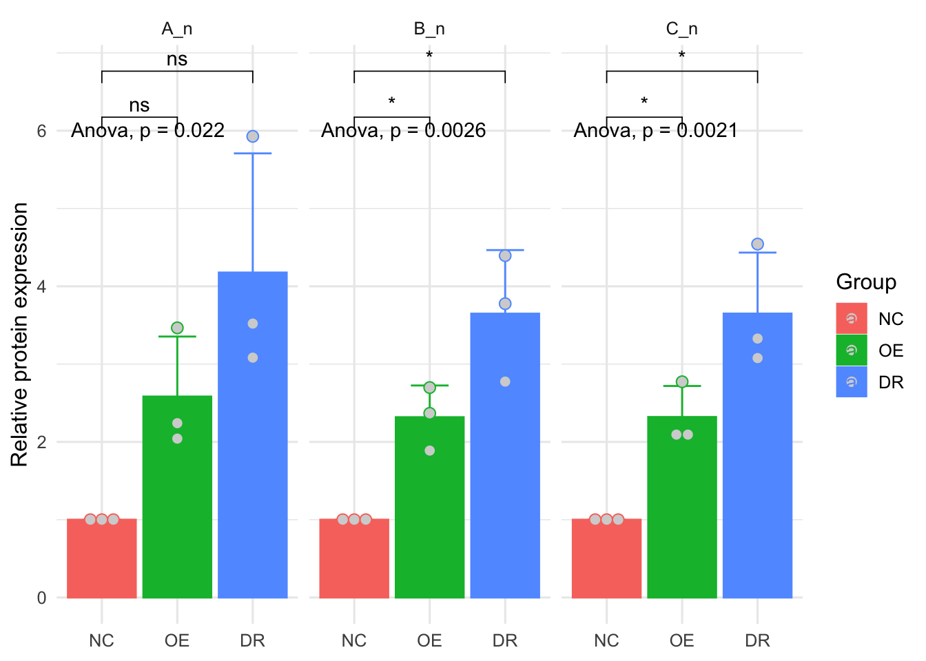
也可以提取某一个蛋白的数据,进行毕竟,比如只看B蛋白的数据,可以用下面的函数,然后作图
B<-wb_long[wb_long$Protein == 'B_n',]
ggplot(B ,
       aes(x=Group,y=Value,color=Group,fill=Group))+
    geom_bar(stat="summary",fun=mean,position="dodge")+
    stat_summary(fun.data = 'mean_sd', geom = "errorbar", width = 0.5,position = position_dodge(0.9))+
    theme_minimal(base_size = 12)+
    labs(x=NULL,y='Relative protein expression')+
    geom_dotplot(stackdir = "center", binaxis = "y",
                 fill = "lightgray",
                 dotsize = 0.9,position = position_dodge(0.9))+
    stat_compare_means(method = "anova")+
    stat_compare_means(method = 't.test',label = "p.signif",comparisons = list(c('NC','OE'),c('NC','DR')))
## Bin width defaults to 1/30 of the range of the data. Pick better value with `binwidth`.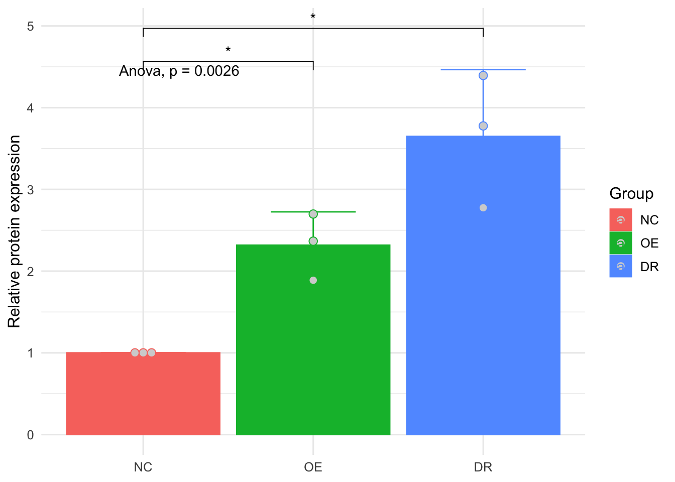
当然也可以换个主题和配色,可以用ggsci,也可以用ggplot的自定义,这里用ggsci的lancet配色
library(ggsci)
ggplot(B ,
       aes(x=Group,y=Value,color=Group,fill=Group))+
    geom_bar(stat="summary",fun=mean,position="dodge")+
    stat_summary(fun.data = 'mean_sd', geom = "errorbar", width = 0.5,position = position_dodge(0.9))+
    theme_bw(base_size = 12)+
    scale_color_lancet()+
    scale_fill_lancet()+
    labs(x=NULL,y='Relative protein expression')+
    geom_dotplot(stackdir = "center", binaxis = "y",
                 fill = "lightgray",
                 dotsize = 0.9,position = position_dodge(0.9))+
    stat_compare_means(method = "anova")+
    stat_compare_means(method = 't.test',label = "p.signif",comparisons = list(c('NC','OE'),c('NC','DR')))
## Bin width defaults to 1/30 of the range of the data. Pick better value with `binwidth`.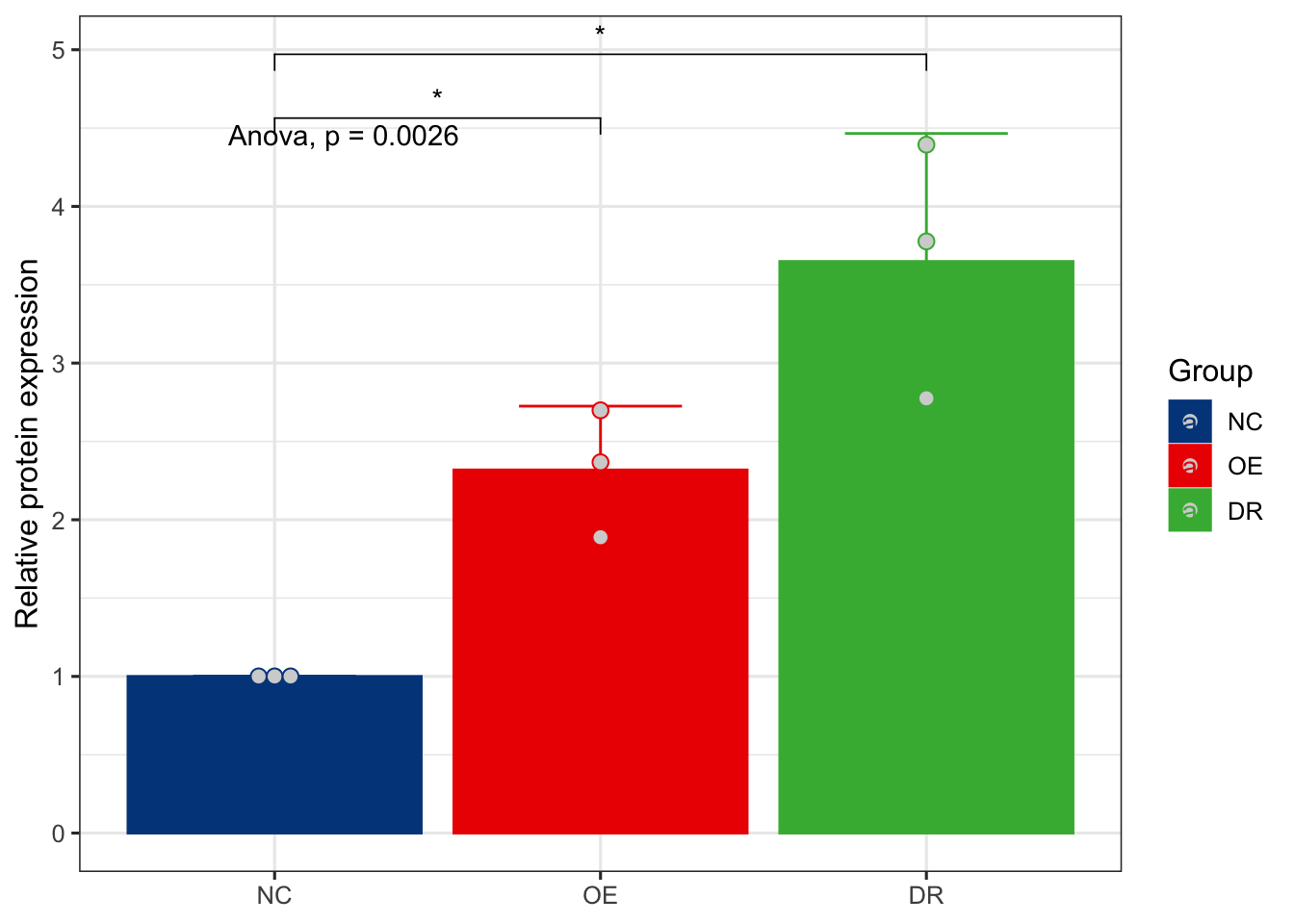 ## 这里手动添加配色,然后把标签去掉,因为底下已经有标签了,加一句
theme(legend.position = 'none')
ggplot(B ,
       aes(x=Group,y=Value,color=Group,fill=Group))+
    geom_bar(stat="summary",fun=mean,position="dodge")+
    stat_summary(fun.data = 'mean_sd', geom = "errorbar", width = 0.5,position = position_dodge(0.9))+
    theme_bw(base_size = 12)+
    scale_color_manual(values = c('gray','steelblue','firebrick'))+
    scale_fill_manual(values = c('gray','steelblue','firebrick'))+
    labs(x=NULL,y='Relative protein expression')+
    geom_dotplot(stackdir = "center", binaxis = "y",
                 fill = "lightgray",
                 dotsize = 0.9,position = position_dodge(0.9))+
    stat_compare_means(method = "anova")+
    stat_compare_means(method = 't.test',label = "p.signif",comparisons = list(c('NC','OE'),c('NC','DR')))+theme(legend.position = 'none')
## Bin width defaults to 1/30 of the range of the data. Pick better value with `binwidth`.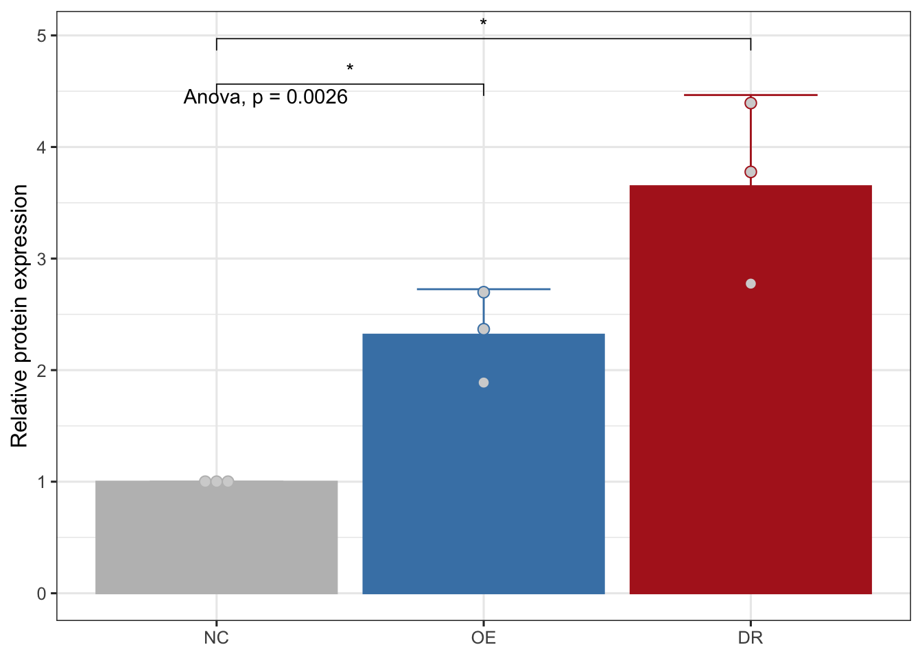
欧阳松
主治医师、讲师
My research interests include urogenital tumors, urolithiasis, male infertility, male erectile dysfunction,etc.