单基因的肿瘤细胞系表达怎么看?CCLE告诉你
泛癌的基因表达量一般可以用TCGA和GTEx实现,而肿瘤细胞系一般用CCLE数据库.
临床生信之家是一个很好的在线工具,目前上架了CCLE的功能,出的图见下,可以实现单基因在泛癌和单病种的可视化,但是这个网址什么都好,就是有次数限制,后面使用要加钱,而且价钱不菲,学生党望而却步。。。
会R语言,当然可以省掉这笔巨款,而且可以DIY,乐趣无穷
首先去CCLE官网下载数据,目前网页更新了,功能也多了
比如TP53,访问这个网址TP53 DepMap Gene Summary就行,在Characterization里Expression 21Q2 Public右边有个下载标志,基因单位是Log2(TPM+1),很科学
CCLE2021年的更新了很多,比以前好看多了,也科学多了啊…
下载后的数据默认命名是: [TP53 Expression 21Q2 Public.csv`] (https://depmap.org/portal/partials/entity_summary/download?entity_id=38037&dep_enum_name=expression&size_biom_enum_name=none&color=none)
不过这里最大的问题就是国内访问的速度真的是很随机啊,想快有时候根本快不了,如果电脑一直打不开,就用手机打开再传到电脑上吧,当然你也可以去hiplot.com.cn上去下载数据,虽然不是最新的,然而至少网速很快,但是需要二次处理一下数据
首先把数据读进R里面
library(readr)
TP53_Expression_21Q2_Public <- read_csv("~/Desktop/TP53 Expression 21Q2 Public.csv")
## Rows: 1378 Columns: 6## ─ Column specification ────────────────────────────
## Delimiter: ","
## chr (5): Depmap ID, Cell Line Name, Primary Disease, Lineage, Lineage Subtype
## dbl (1): Expression 21Q2 Public##
## ℹ Use `spec()` to retrieve the full column specification for this data.
## ℹ Specify the column types or set `show_col_types = FALSE` to quiet this message.可以看到表格里很多有用信息,包括基因表达量、细胞系名、原发病、器官和亚型,这样我们不用二次处理了,可以跑代码了
- 第一步,画个泛癌的boxplot,可以用ggplot2,也可以用ggpubr的ggboxplot函数,但是最好还是ggplot2,可以按中位数排序,标上均数标准差,还可以标一下所有数值的均值
library(ggplot2)
library(ggpubr)
ggplot(TP53_Expression_21Q2_Public,
       aes(x = reorder(`Primary Disease`,`Expression 21Q2 Public`, FUN = median),  #按中位数自动排序
           y =`Expression 21Q2 Public`,color=`Primary Disease`)) + #y也可以是Lineage
    geom_boxplot()+ #添加boxplot
    geom_point() + #添加点
    theme_classic(base_size = 12)+ #主题和字体大小
    rotate_x_text(45)+ #X轴45度倾斜一下
    theme(legend.position="none")+ #不需要显示标签
    xlab(NULL)+ylab("TP53 expression \nLog2(TPM+1)")+ #改下坐标名称
    stat_summary(fun.data = 'mean_sd', geom = "errorbar", width = 0.5,position = position_dodge(0.9))+ #自动计算均数标准差,加个误差棒
    geom_hline(yintercept = mean(TP53_Expression_21Q2_Public$`Expression 21Q2 Public`), lty = 2)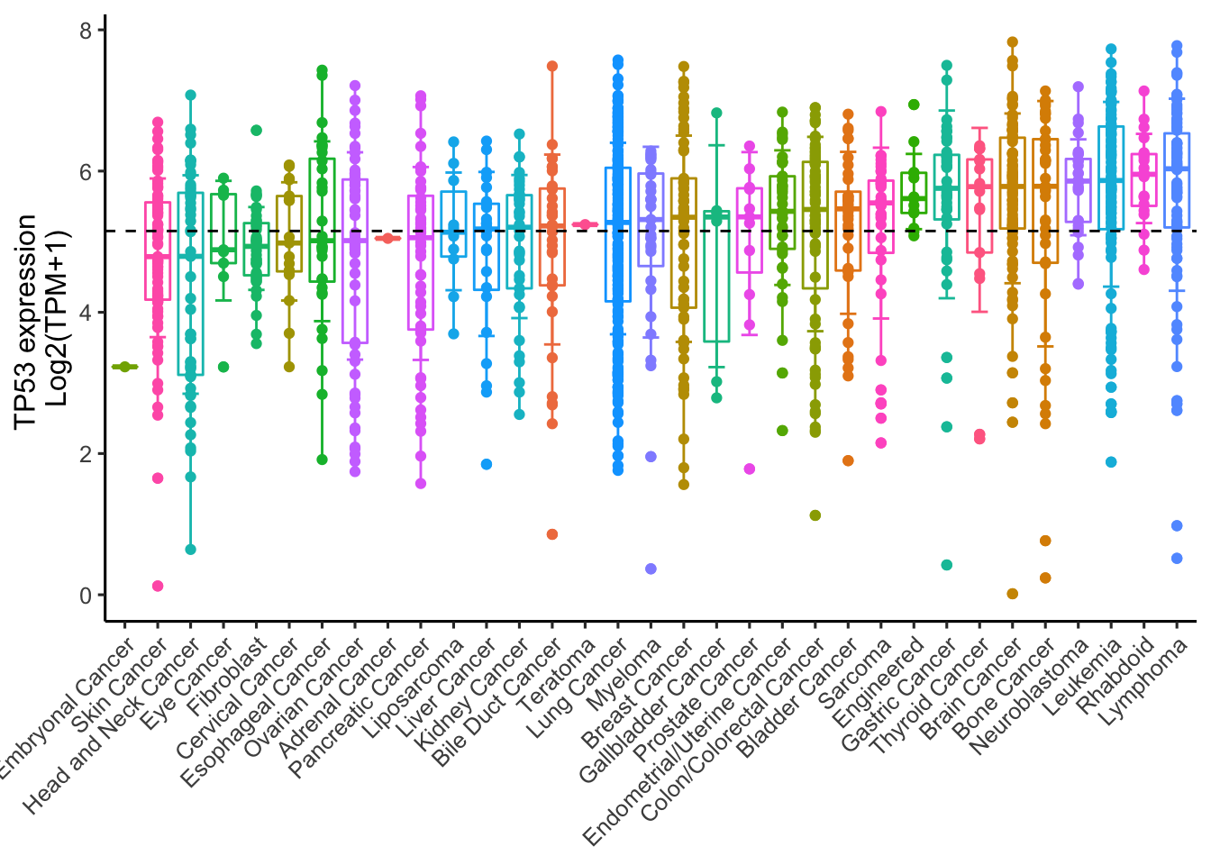
#自动计算均值,标个虚线当然也可以统计一下差异,再加一句+stat_compare_means(method = "anova")就行。
第二步,提取单个癌症的数据画个棒棒糖图,可以用
ggplot2,也可以用ggpubr的ggdotchart画图,不过最好还是ggplot2比如,你只想提取肾癌的数据,可以用这个公式,由于是文字,需要加引号,如果是数字,就不需要引号
data<-TP53_Expression_21Q2_Public[TP53_Expression_21Q2_Public$`Primary Disease` == 'Kidney Cancer',]我是这样设计图片的,以点的大小代表基因表达量,按颜色表达程度,颜色从蓝到红,可以从大到小排序,也可以从小到大排列,然后用均数隔开
ggplot(data, aes(x=reorder(`Cell Line Name`,`Expression 21Q2 Public`), y=`Expression 21Q2 Public`)) +
    geom_point(aes(size=`Expression 21Q2 Public`,color=`Expression 21Q2 Public`),stat='identity') +scale_color_continuous(low='blue' ,high='red') +
    geom_segment(aes(y = mean(`Expression 21Q2 Public`),
                     x = `Cell Line Name`,
                     yend = `Expression 21Q2 Public`,
                     xend = `Cell Line Name`),
                 color = "black") +
    theme_classic(base_size = 12) +
    coord_flip() +
    xlab(NULL)+ylab("TP53 expression")+
    geom_hline(yintercept = mean(data$`Expression 21Q2 Public`), lty = 2)
从小到大再来一次,reorder里加个-就行
ggplot(data, aes(x=reorder(`Cell Line Name`,-`Expression 21Q2 Public`), y=`Expression 21Q2 Public`)) +
    geom_point(aes(size=`Expression 21Q2 Public`,color=`Expression 21Q2 Public`),stat='identity') +scale_color_continuous(low='blue' ,high='red') +
    geom_segment(aes(y = mean(`Expression 21Q2 Public`),
                     x = `Cell Line Name`,
                     yend = `Expression 21Q2 Public`,
                     xend = `Cell Line Name`),
                 color = "black") +
    theme_classic(base_size = 12) +
    coord_flip() +
    xlab(NULL)+ylab("TP53 expression")+
    geom_hline(yintercept = mean(data$`Expression 21Q2 Public`), lty = 2)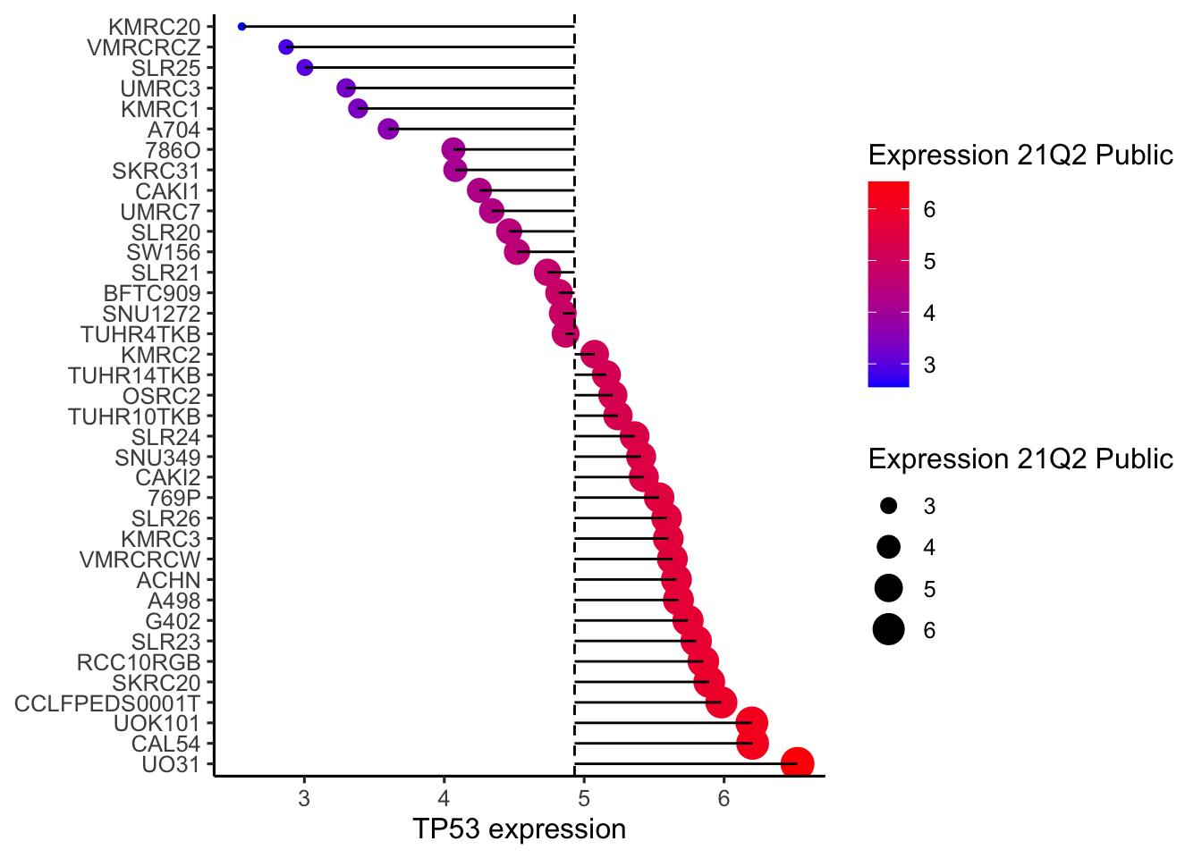
不要钱的,不香吗?
欧阳松
主治医师、讲师
My research interests include urogenital tumors, urolithiasis, male infertility, male erectile dysfunction,etc.