纯纯的ggplot2画好看的柱状图,统计、分面
柱状图是最常见的统计作图,当然Excel和Prism都可以画,还有一些shiny可以交互画图,但是用R的话,也可以有很好看的效果,本文用Rmarkdown做下效果,要有统计结果,要有统计标识,还有个各个样本的数值.
比如有这样一个表:
| Value | Group | Gene | Value |
|---|---|---|---|
| 1.092 | Control | GeneA | 1.092 |
| 0.875 | Control | GeneA | 0.875 |
| 1.047 | Control | GeneA | 1.047 |
| 22.111 | Treat | GeneA | 22.111 |
| 18.852 | Treat | GeneA | 18.852 |
| 22.575 | Treat | GeneA | 22.575 |
| 1.057 | Control | GeneB | 1.057 |
| 1.057 | Control | GeneB | 1.057 |
| 0.895 | Control | GeneB | 0.895 |
| 51.268 | Treat | GeneB | 51.268 |
| 43.411 | Treat | GeneB | 43.411 |
| 46.851 | Treat | GeneB | 46.851 |
| 0.975 | Control | GeneC | 0.975 |
| 0.968 | Control | GeneC | 0.968 |
| 1.059 | Control | GeneC | 1.059 |
| 14.156 | Treat | GeneC | 14.156 |
| 16.374 | Treat | GeneC | 16.374 |
| 19.338 | Treat | GeneC | 19.338 |
如果是在excel上,我们其实可以用代码直接复制过来
data <- read.table(pipe(“pbpaste”), # 读取剪切板中的数据 sep=", # 指定分隔符 header = TRUE
当然我们也可以直接用代码导入进来,最好是csv格式的,这个格式稳定,当然也可以直接用File的Import Dataset
data <- read.csv("~/Desktop/data.csv")library(ggplot2) #画图
library(ggpubr) ### 加载了这个包就不用再次统计均数和标准差了,统计也方便
library(ggsignif) ### 统计,当然用ggpubr的话会更简单,但是标识线的颜色改不了
ggplot(data,
aes(x=Group,y=Value,color=Group,fill=Group))+
geom_bar(stat="summary",fun=mean,position="dodge")+ #柱状图
stat_summary(fun.data = 'mean_sd', geom = "errorbar", width = 0.5,position = position_dodge(0.9))+ ##'mean_sd' 自动计算均数+标准差,添加误差棒,当然也可以计算mean+se,mean_ci等,跟ggpubr一模一样,width可以设置误差棒的宽度,而0.9是误差棒的位置
facet_grid(~Gene,scales = 'free')+ #分面
theme_minimal(base_size = 13)+ #主题和字体大小
scale_color_manual(values = c('steelblue','firebrick'))+
scale_fill_manual(values = c('steelblue','firebrick'))+
geom_signif(comparisons = list(c("Control","Treat")),test = 't.test')+
labs(x=NULL,y='Relative gene expression')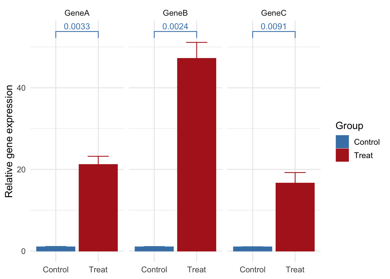
如果不想显示具体的P值,还可以自动标星号, geom_signif里面加一句map_signif_level=T
ggplot(data,
       aes(x=Group,y=Value,color=Group,fill=Group))+
    geom_bar(stat="summary",fun=mean,position="dodge")+
    stat_summary(fun.data = 'mean_sd', geom = "errorbar", width = 0.5,position = position_dodge(0.9))+
    facet_grid(~Gene,scales = 'free')+
    theme_minimal(base_size = 13)+
    scale_color_manual(values = c('steelblue','firebrick'))+
    scale_fill_manual(values = c('steelblue','firebrick'))+
    geom_signif(comparisons = list(c("Control","Treat")),map_signif_level=T,test = 't.test')+
    labs(x=NULL,y='Relative gene expression')+
    geom_dotplot(stackdir = "center", binaxis = "y",
                 fill = "gray",
                 dotsize = 0.9,position = position_dodge(0.9))
## Bin width defaults to 1/30 of the range of the data. Pick better value with `binwidth`.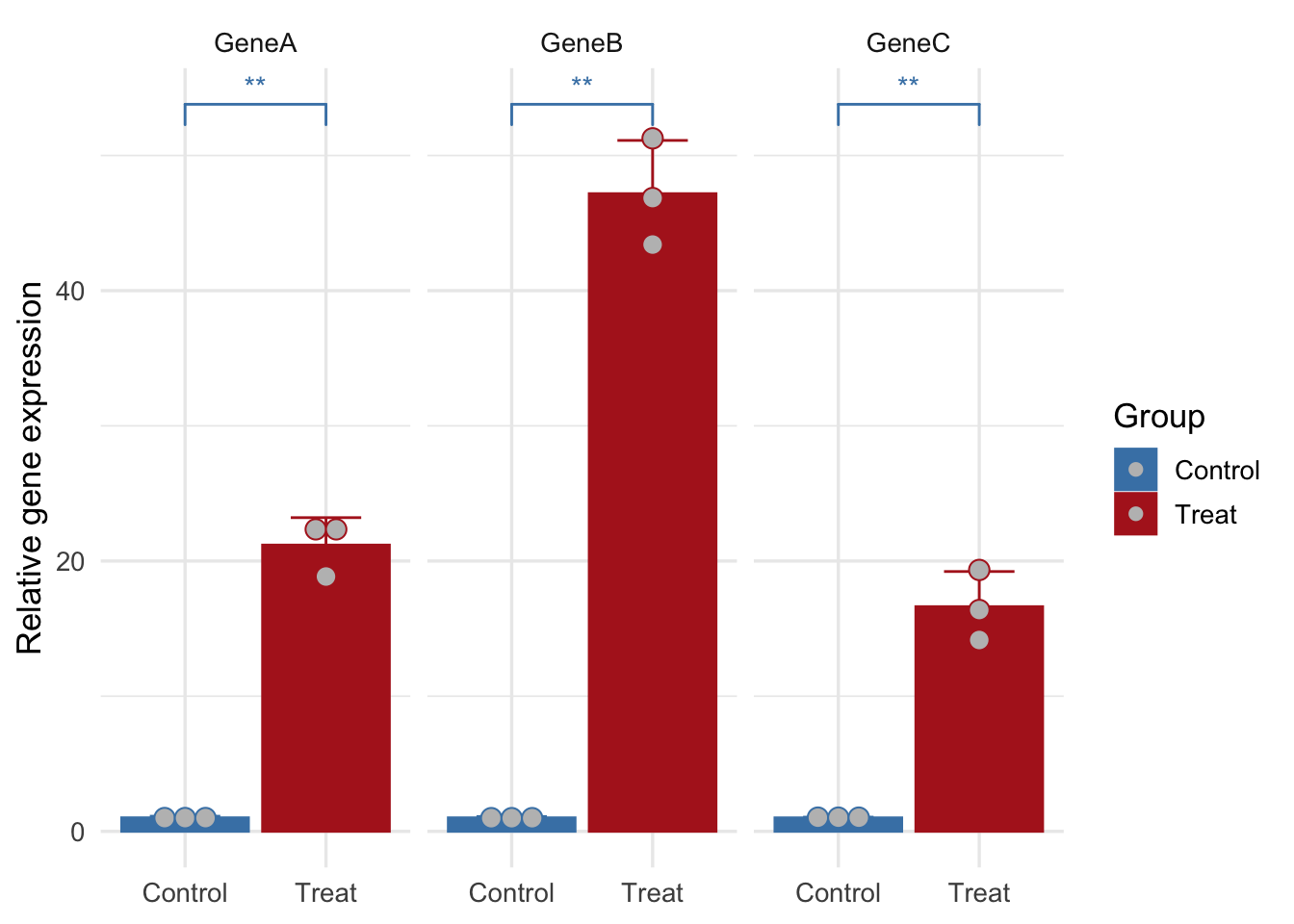
比如你不想要Group的标签,也想换个prism主题假装一下grahpad作图,也可以的
library(ggprism)
ggplot(data,
       aes(x=Group,y=Value,color=Group,fill=Group))+
    geom_bar(stat="summary",fun=mean,position="dodge")+
    stat_summary(fun.data = 'mean_sd', geom = "errorbar", width = 0.5,position = position_dodge(0.9))+
    facet_wrap(~Gene,scales = 'free')+
    theme_prism(base_size = 12)+
    scale_color_manual(values = c('steelblue','brown'))+
    scale_fill_manual(values = c('steelblue','brown'))+
    geom_signif(comparisons = list(c("Control","Treat")),map_signif_level=T,test = 't.test')+
    labs(x=NULL,y='Relative gene expression')+
    geom_dotplot(stackdir = "center", binaxis = "y",
                 fill = "gray",
                 dotsize = 0.9,position = position_dodge(0.9))+
     theme(legend.position ="none")
## Bin width defaults to 1/30 of the range of the data. Pick better value with `binwidth`.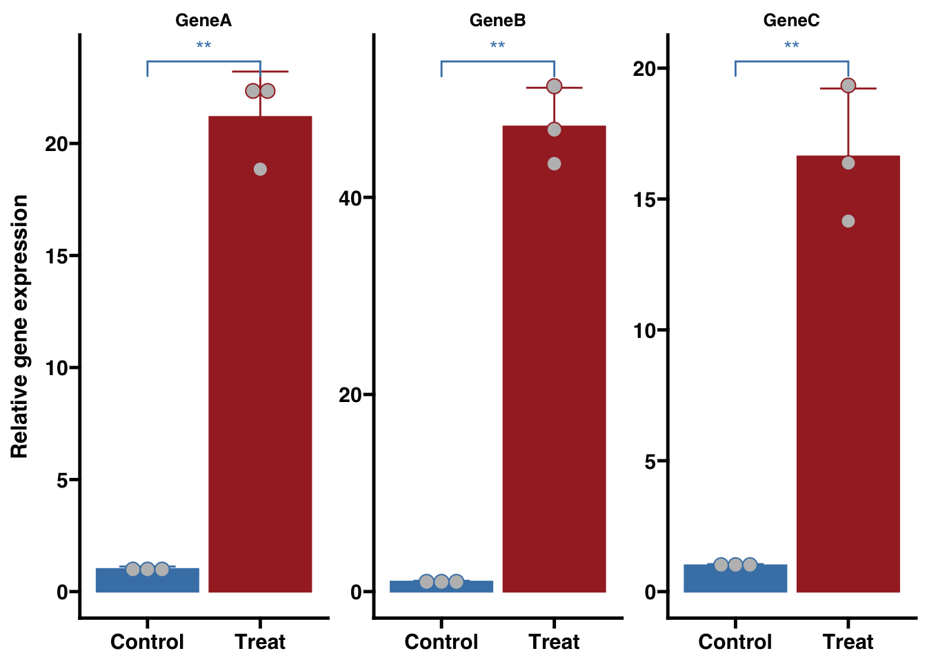
如果觉得两组相差太大,想要截断一下,以前没有好的解决方案,后面著名的Y叔叔出手开发了’ggbreak’,几乎就完美解决了,不过还有bug,就是不能使用geom_dotplot,因为底下的点就放大,就像下面这样很难看,所以暂时不加载dotplot
## install.packages("ggbreak") #需要安装的只要一条指令
library(ggbreak)
ggplot(data,
       aes(x=Group,y=Value,color=Group,fill=Group))+
    geom_bar(stat="summary",fun=mean,position="dodge")+
    stat_summary(fun.data = 'mean_sd', geom = "errorbar", width = 0.5,position = position_dodge(0.9))+
    facet_grid(~Gene,scales = 'free')+
    theme_minimal(base_size = 13)+
    scale_color_manual(values = c('steelblue','firebrick'))+
    scale_fill_manual(values = c('steelblue','firebrick'))+
    geom_signif(comparisons = list(c("Control","Treat")),map_signif_level=T,test = 't.test')+
    labs(x=NULL,y='Relative gene expression')+
   geom_dotplot(stackdir = "center", binaxis = "y",
                 fill = "gray",
                 dotsize = 0.9,position = position_dodge(0.9))+
  scale_y_break(c(1.5, 10) , scales='free')
## Bin width defaults to 1/30 of the range of the data. Pick better value with `binwidth`.
## Bin width defaults to 1/30 of the range of the data. Pick better value with `binwidth`.
## Bin width defaults to 1/30 of the range of the data. Pick better value with `binwidth`.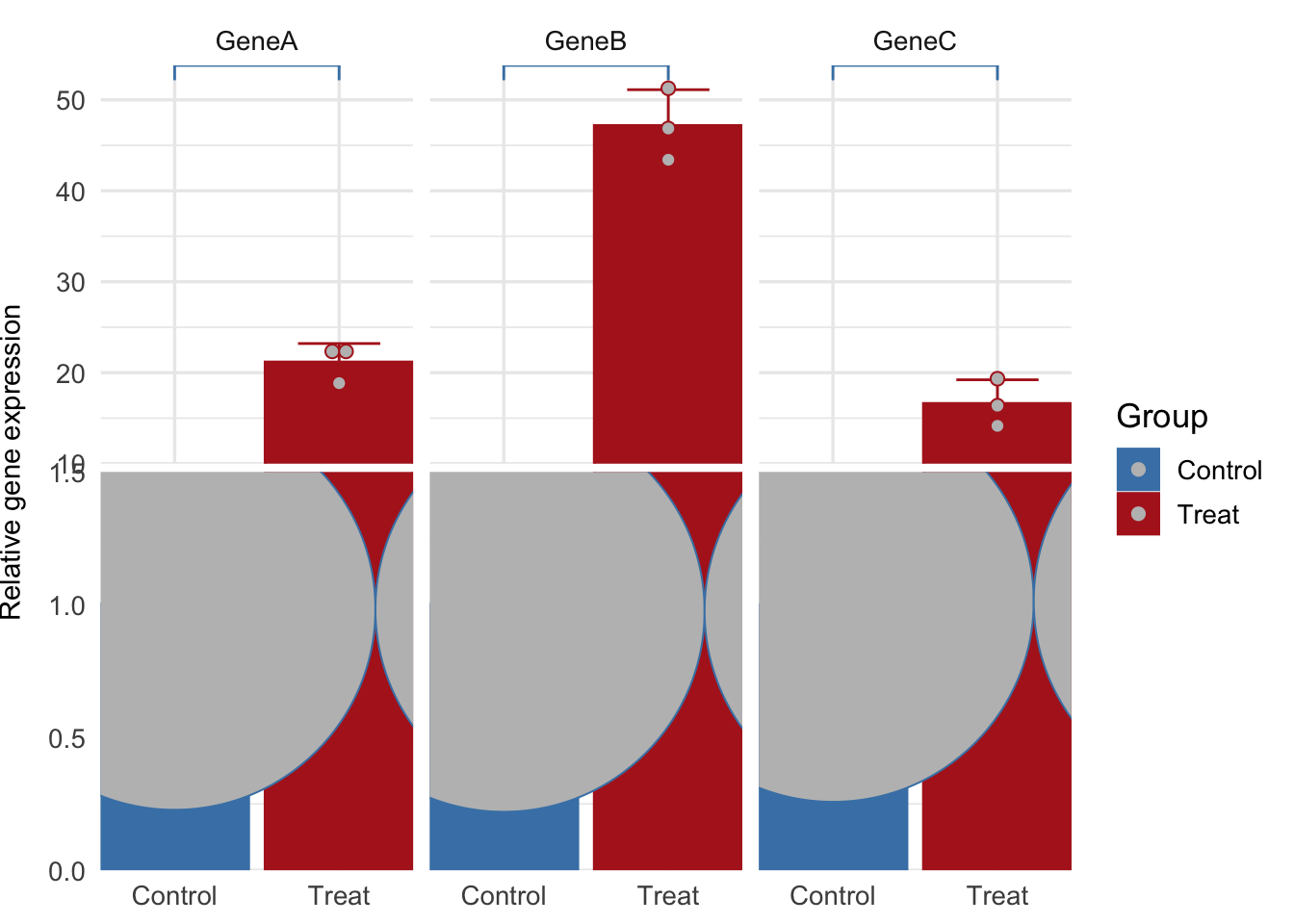
所以暂时不加载dotplot, 而且分面的截断不太好,不过可以自己慢慢摸索
ggplot(data,
       aes(x=Group,y=Value,color=Group,fill=Group))+
    geom_bar(stat="summary",fun=mean,position="dodge")+
    stat_summary(fun.data = 'mean_sd', geom = "errorbar", width = 0.5,position = position_dodge(0.9))+
    facet_grid(~Gene,scales = 'free')+
    theme_minimal(base_size = 13)+
    scale_color_manual(values = c('steelblue','firebrick'))+
    scale_fill_manual(values = c('steelblue','firebrick'))+
    geom_signif(comparisons = list(c("Control","Treat")),map_signif_level=T,test = 't.test')+
    labs(x=NULL,y='Relative gene expression')+
  scale_y_break(c(1.5, 10) , scales='free')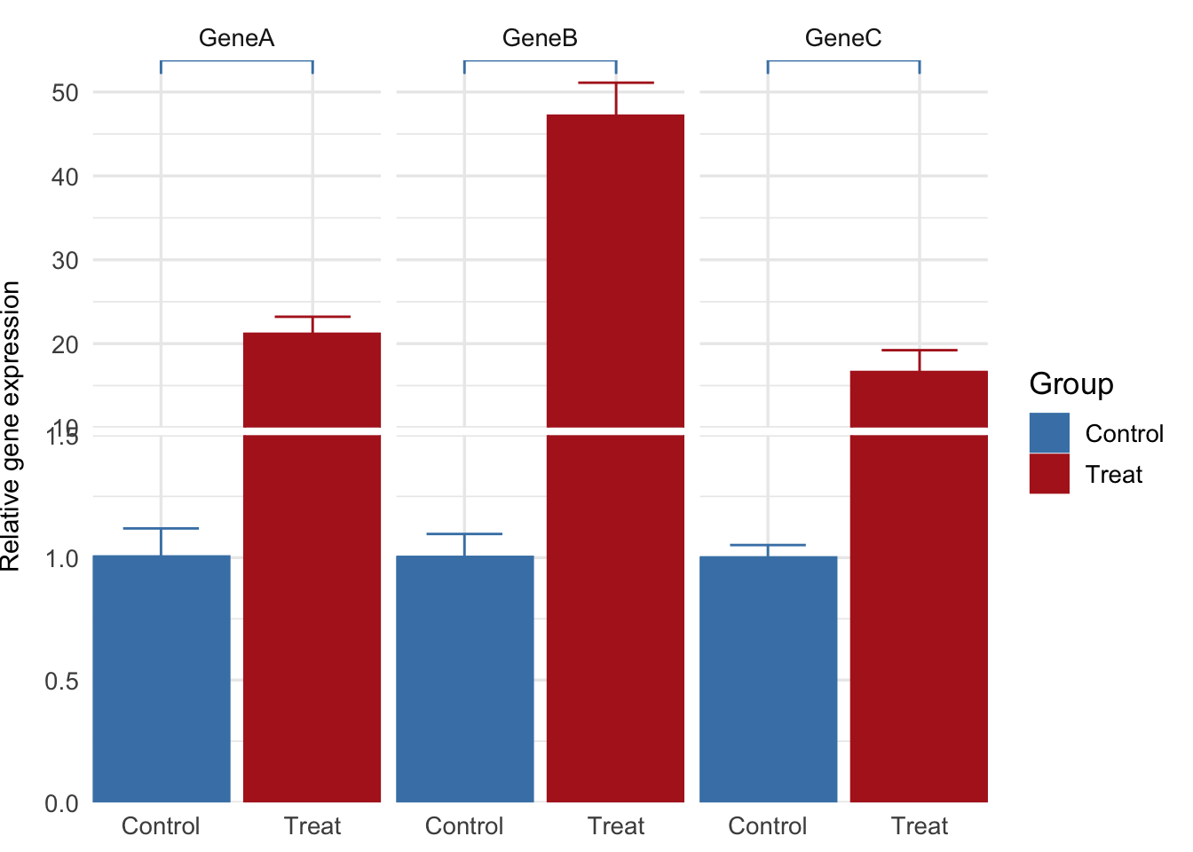
欧阳松
主治医师、讲师
My research interests include urogenital tumors, urolithiasis, male infertility, male erectile dysfunction,etc.