R语言处理CCK8或MTT数据,一步绘制生长曲线
CCK8数据主要是统计OD450的吸收值,一般的数据形式如下,保存为csv格式
| Time | NC | NC | NC | OE | OE | OE |
|---|---|---|---|---|---|---|
| day1 | 0.549070969 | 0.549570976 | 0.547750963 | 0.543670962 | 0.536370963 | 0.545970956 |
| day2 | 0.675742972 | 0.696628983 | 0.690574949 | 0.637390961 | 0.630422963 | 0.653620952 |
| day3 | 0.894142977 | 0.884125994 | 0.882670941 | 0.82057096 | 0.803780962 | 0.819401947 |
| day4 | 1.179670983 | 1.18457301 | 1.178542929 | 1.074040958 | 1.067993961 | 1.052209937 |
| day5 | 1.505662991 | 1.507610027 | 1.500910915 | 1.387150955 | 1.32420196 | 1.389946927 |
首先我们要进行数据的预处理,把短数据转换为长数据,然后用ggpubr一步作图
cck8 <- read.csv("~/Desktop/cck8.csv")
## 宽数据转换为长数据
library(reshape2)
cck8_long<-melt(cck8,
                 id.vars = c('Time'),
                 variable.name='Sample',
                 value.name='OD450')
## 新增一个分组
cck8_long$Group=rep(c('control', 'treat'), each = 15)  ##分为两组,每组15个数据
### 使用ggpubr画图,可以使用prism主题
library(ggpubr)
## 载入需要的程辑包:ggplot2library(ggprism)
ggline(cck8_long, x = "Time", y = "OD450",
color = "Group",shape='Group',
add = "mean_sd",ylab = "OD450 value",
ggtheme = theme_prism(base_size = 12))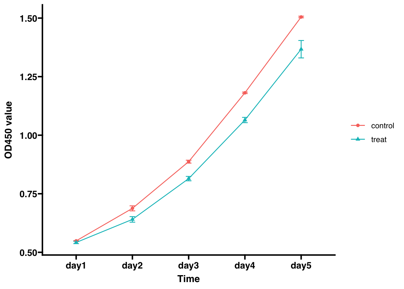
加个P值,调整坐标,适当美化
- 首先预统计看下结果,记得统计方法一定是’anova’,而不是’t.test’
compare_means(OD450~Group, data=cck8_long, group.by = "Time",method = 'anova')## # A tibble: 5 x 7
## Time .y. p p.adj p.format p.signif method
## <chr> <chr> <dbl> <dbl> <chr> <chr> <chr>
## 1 day1 OD450 0.0823 0.082 0.08228 ns Anova
## 2 day2 OD450 0.00701 0.014 0.00701 ** Anova
## 3 day3 OD450 0.000371 0.0015 0.00037 *** Anova
## 4 day4 OD450 0.0000675 0.00034 6.7e-05 **** Anova
## 5 day5 OD450 0.00309 0.0093 0.00309 ** Anova- 结果还不错,接着添加显著标志,改色lancet配色
ggline(cck8_long, x = "Time", y = "OD450",
color = "Group",shape='Group', title = 'xxx cell',
add = "mean_sd", palette = 'lancet',ylab = "OD450 value",legend = c(0.1,0.9),
ggtheme = theme_prism(base_size = 12))+stat_compare_means(label = "p.signif",
aes(group=Group),
method = "anova",
hide.ns = TRUE)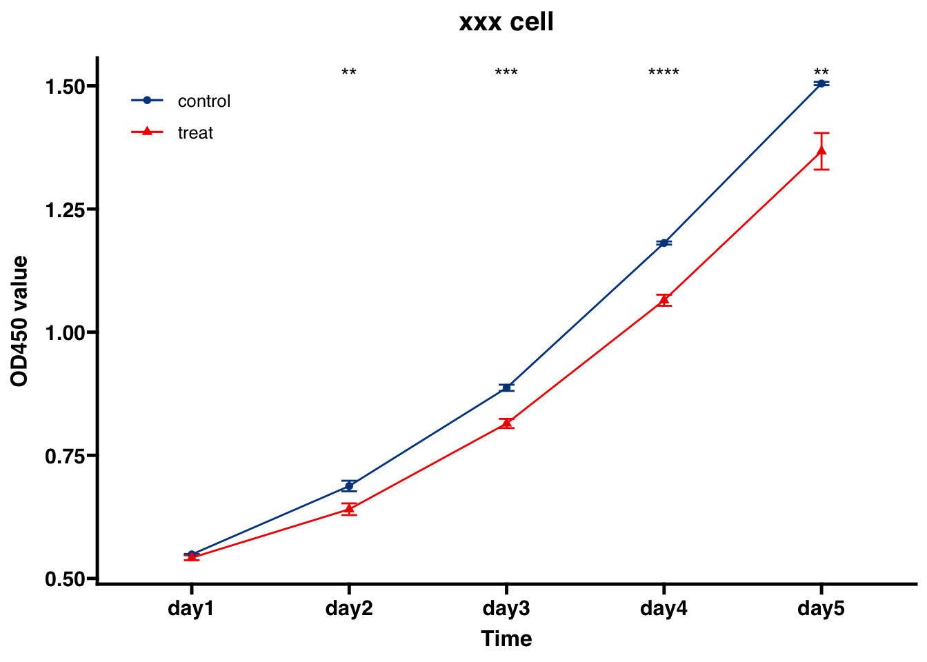 - 可以调的细节还有很多,比如换个背景
ggline(cck8_long, x = "Time", y = "OD450",
color = "Group",shape='Group', title = 'xxx cell',
add = "mean_sd", palette = 'lancet',ylab = "OD450 value",legend = c(0.1,0.8),
ggtheme = theme_bw(base_size = 12))+stat_compare_means(label = "p.signif",
aes(group=Group),
method = "anova",
hide.ns = TRUE)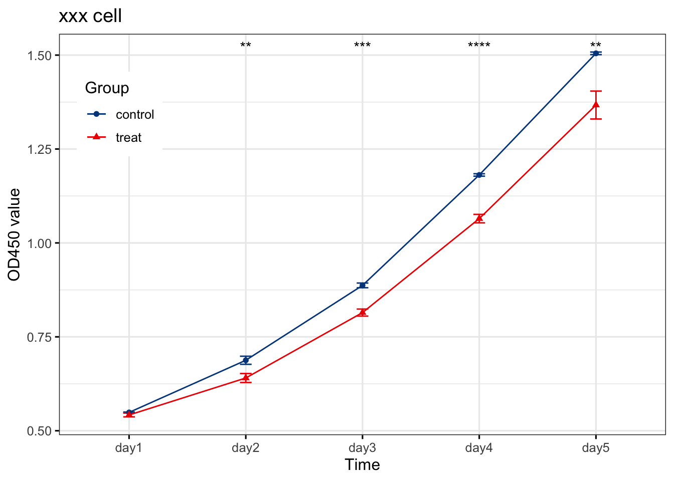 细节地方AI处理一下,当然如果你安装了
esquisse,你也可以直接导出成PPT
esquisse:::ggplot_to_ppt()## 载入需要的名字空间:rvg## No ggplot object in environment...欧阳松
主治医师、讲师
My research interests include urogenital tumors, urolithiasis, male infertility, male erectile dysfunction,etc.